"Enthusiasm is the power that transfers mental blueprints into the physical dimension" - Eckhart Tolle
Foreword
So this is a piece about my long-running AI experiment which is meant to help find some more evidence for an idea I proposed here Hello World - Measures Of Language Skill | A Logic Called Joe (webador.co.uk). A summary of which is that I am looking for the bite point in which an AI might get better at learning a language in the same way we do. This is admittedly a bit of a stretch kind of up there with expecting Deliveroo to have the holy grail in stock. Nonetheless, I have seen a few things that give me hope.
So I was thinking that to tackle this problem, all I had been doing was increasing network size. I hadn't looked if width or depth was a bigger deal in constructing this type of neural network that has enough modifications to behave differently. In normal neural networks as a rule of thumb, a 3 neurone by 3 depth network is enough to calculate any mathematical equation, while 4 by 4 is capable of handling where have logic gates involved.
What I decided I would need to work out is where (if anywhere) there is a step up in performance on an AGI task. This would be beneficial because if an AI with smaller depth was efficient then you would be wasting a lot of computational power.
This leads me to start researching graphing and visualising in multiple dimensions.
Learning How To Make Multidimensional Graphs
So I started investigating how to make multidimensional graphs. I can say I think there is an upper limit to graph data at around 3 dimensions. You can go higher using opaqueness, heat mapping, different colour gradients all can be overlaid to give more information but I think this quickly strays into chart junk. I always mention chart junk when discussing graphs because corporations have a bad habit of promoting garishly coloured, massively inked many-dimensional graphs which are in reality just bar graphs; that a warning has to be given... use these graphs where the data warrants it not because 3d is better than 2d.
If the question is about the relationship between 3 values whether they correlate this can be useful. Other than that extra dimensions are just extra complexity; Graphs are a visual piece of work that communicates information simply anything that adds unnecessary complexity ought to be removed.
Luckily I can do 3d graphs in my favourite language python.
Matplotlib
To make a 3-dimensional graph I use my go-to libraries are these and you import them in code like this and traditional you name them like this.
from mpl_toolkits import mplot3d
import NumPy as np
import matplotlib.pyplot as plt
So we are going to be working with Matplotlib and to start getting our heads around how this visualisation tool works the below commands generate a blank 3d plot space over which matplotlib will work and calculate how it will then plot the rest of the visualisation over. So you can guess how matplotlib works are to plot circles and lines over the below blank canvas.
fig = plt.figure()
ax = plt.axes(projection ='3d')
Show Me The Graphs
So I can hear you but how do these graphs look. See below line graph in 3d. For me though the scatter graph was better.

I like the 3 dimensional scatter graphs the most. I think this is simple to use and probably could see some use in many businesses where need to graph the relationship between certain values with little explanation or mathematical expertise needed. It strikes me that the 3d scatter plot is the only one that you could throw together without much concern and the others are all for visualising specific complex mathematical functions as a state space.
I can see the 3d scatter plot being used in say business I cannot imagine the others would be of routine use.
Especially as in a lot of cases if you start with a 3d scatter graph you will see if there are curves in the data that might better be shown using another graph type.

Though the wireframe is also pretty great for visualising mathematical formulas.

How To Build
So we will be using matplotlib to create some 3-dimensional graphs.
Scatter Graph
Scatter Graph I think is the easiest 3-dimensional graph to use. We all have data in businesses where 3 values like SLA, several staff, and time at work are all known to correlate but we have no idea how to report on it. Well, these graphs can be produced quite easily in python. The inputs list1, list2, and list3 equal X, Y, and Z axes as you would expect.
Matplotlib works with NumPy so we have to wrap the lists with np. array() to make them np arrays.
Below is the method I use for producing a lot of my AI test graphs.
fig = plt.figure()
ax = plt.axes(projection='3d')
ax.scatter3D(np.array(list1), np.array(list2), np.array(list3), color='blue')
plt.show()
Line Graph
Created from the following code uses NumPy linspace function to produce uniformly spaced 1 dimension list-like array (array is the basic building block of NumPy) we call this value z. The X and Y values then use this Z value to manipulate using sin and cos and then plot it using the 3D plotting package. The graph you get shows the 3-dimensional relationship between sin and cos.
Something to bear in mind is that a 3d line graph is a series of numbers. A 2d line graph is easily understood one of the dimensions X or Y is usually time and the other a count. In a 3d line graph, the data input has to be ordered and while this is easily understood with some maths and data literacy it might surprise some if unaware needed to feed in the data pre-ordered because they had imagined it worked identically to the 2d line graph.
#line plot
fig = plt.figure()
ax = plt.axes(projection='3d')
z = np.linspace(0, 1, 100)
print(z)
x = z * np.sin(30 * z)
y = z * np.cos(30 * z)
ax.plot3D(x, y, z, 'maroon')
ax.set_title('3D line plot')
plt.show()
Wireframe
The wireframe is nice visually it is quite striking and works as a way to visualize a mathematical function's state space. below is the sum of linespace -6 to 6 over 30 values to the power of two summed finding the square root (yes that's Pythagoras theorem) and then using sine to find the angle of the triangle.
The below graph is the visualisation of sin angle for triangles, all right angled triangles....
So below you have a visualization for the sin angle of a right-angle triangle.
def f(x, y):
return np.sin(np.sqrt(x ** 2 + y ** 2))
x = np.linspace(-6, 6, 30)
y = np.linspace(-6, 6, 30)
X, Y = np.meshgrid(x, y)
Z = f(X, Y)
fig = plt.figure()
ax = plt.axes(projection='3d')
ax.plot_wireframe(X, Y, Z, color='black')
ax.set_title('wireframe')
plt.show()
plt.close()

What Can I Use This For
Well, so far I have used this in two places one where what I am investigating is a complete mathematical function that I want to visualize aka the Perlin Noise I discuss below. Or I am investigating something that just so happens to have more than one related dimension and I used this for graphing my AI work.
Perlin Noise
So to start showing where I think you can use these tools I can show you two projects I am working on. Below I was using my random number generators and seeing what they look like when generating fields of noise (sequential pseudo related random numbers); which is discussed here Pseudo-Random Numbers Oversimplified | A Logic Called Joe (webador.co.uk).
While the numbers look chaotic they are produced by mathematical functions and so one method of thinking about maths is to blow them up produce lots of numbers using them and graph them. If there were any problems like they statistically drop out you could see it as dropping to zero. I have spotted a few bad ideas this way by simply graphing the space that the mathematical function has using X and Ys to see if they were useful for producing random numbers.


AGI Test Update
I had started looking to see if I needed more information. The experiment that I am currently running just increases the width and depth of the neural network making it bigger and then repeating the Bayesian Turing test that I describe above. The test in simple terms is looking to see if the network learns to predict the next letters in a book being read to it purely from previous experience which it would need to generalize and essentially is being tasked with learning English from the book.
This test is meant to help me determine if I got 3 things right, one is an engineering solution that ought to have eliminated the vanishing gradient problem. A test that the neural network has memory substantial enough to remember complex patterns and 3rd is could it provide something like conscious
I feel that I have evidence for the first two as I have scaled this network up without issue, it has already demonstrated memory as a number of the networks has done well in figuring out that there were paragraph numbers but yet to score highly on language. So far it's been "a" and "he" etc which aren't so. Once it did get the word feed and fed impressive right but then you realise f-e-e-d starts at letter f and rolls up the alphabet and I decided I ought not to get too excited for that as it wasn't hugely technically impressive.
Below is the graph I made the X value is the depth of the network, Y is the width of neurons, and Z is the value for what I have called my Bayesian Turing test.
There is possibly some randomness involved and I probably need to wait for some more data but you can see why I would be excited as at least on the face of it you can see a bigger neural network seems to do better with each increase in size and can work out potentially what depth and width will be optimal for an AGI.
I probably think I need more data but hopefully at some point with enough runs might be able to guess what optimal size looks like. Currently, there remains a good case to say simply bigger is better.

Conclusion
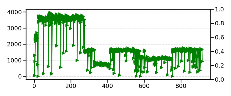
So I don't know whether this will work I might eventually have to call it a day. What I have been getting with some of these bigger networks is a big increase in error and then it collapses down to the same error rate as it previously got. I have been so far chalking this up to neural network trying to learn something it doesn't have scale or capacity to understand and either gets stuck trying to follow a pattern it can't follow.
So I have been working from the basis that this is a scaling problem (if it isn't then maybe this will turn out to have been all a waste of time).
My hope is by graphing the error like the angle function I might be able to detect where there are these peaks and troughs to see if it is related to how the network is sized.
I have seen where I think the network had learned to count the page numbers and that is an impressive feat, I have seen it get a few words right but no big words that you would think must indicate understood language. Given this network type probably cannot just guess the next word based on what it has learned and will need to develop a symbolic map of meaning which unlike a transformer probably makes its job a lot harder.
I think as a project it will continue but I am convinced I am not going to get a breakthrough anytime soon.
I still seem to get the actual comparison between the voice of AI and the book it's trying to match it does appear to be a little bit better each time scale up. I think if I wasn't able to look and see a comparison I might have just decided I had made a mistake and given up.
And there is an interesting lesson in that the ability to detect, iterate and improve is always going to be limited by the ability to first visualise the problem. Hence go make some graphs.

Add comment
Comments