"Learn every day, but especially from the experiences of others. It's cheaper!" John Bogle
This article is about building maps of the stock market how stock prices covary. You might prefer to skip the text and look at the gallery.
Introduction
So I am looking at how to map influence on the stock market. There is a well-known stock market practice of pair trading in that one stock going up and down influences another. This is fairly obvious in many ways a stock that goes down might be haemorrhaging investors one day due to a scandal but tomorrow when compared to the competitors whose fundamental income and profits are probably the same and it will rebound. This seems like stock trading 101. The value of a stock is likely to regress to a mean of averages of its competitors over enough time.
Stocks might go up and down at the same time is that they are similar businesses. All car companies might have their stock prices go down on hearing that cost of iron is going up.
It is the law of any market all stocks compete for investors' money, all investors compete for the best stocks naturally investors move money around and choose to move money between stocks. Other reasons that stock markets might be linked to each other is shared majority ownership, bad news about CEO and billionaire Zuck Markeburg may cause an impact on all the related companies across a group.
So it stands to reason that if we took data and investigated the market, we might create a global map of stocks and shares. I have been working on a neural evolution algorithm for stock trading (though it probably could be generalized across other markets). This uses a genetic algorithm to connect up and optimise the neural networks that are intended to do the trading. This works but is computationally expensive as you end up producing large numbers of AI to see if a given connection or configuration works and dispose of it if it doesn't.
If I could build a method that uses the covariance caused by pair trading to find this covariance that indicates viable pair trading in advance? So maybe I want some form of the stock market map like the below...
Full disclosure I have been thinking of this for a while but it wasn't until I stumbled on this Scikrit learn example Visualizing the stock market structure — scikit-learn 1.0.2 documentation.
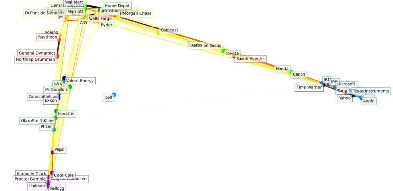
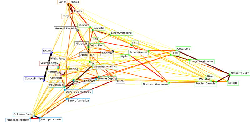
The below was my attempt using live data over the entire stock market data. You should go look at the one for 2017 and see that it is an obvious conclusion that the stock market has a value network but also that value network changes over time. I kind of worried that the market over time might be sliding towards a limited number of major owners.
So upfront all credit goes to the original post as I would not have figured this out without them. I have just tinkered with the original design and was largely unaware of Manifold learning until I read about it.
Has The Stock Market Shifted
So there is widespread concern about inequality between the top 1% and the bottom 99%. In reality That led me to have a view that maybe the Market was being too highly centred on specific clusters. I.e. from the above, there seems to a quite a lot of convergence into groups.
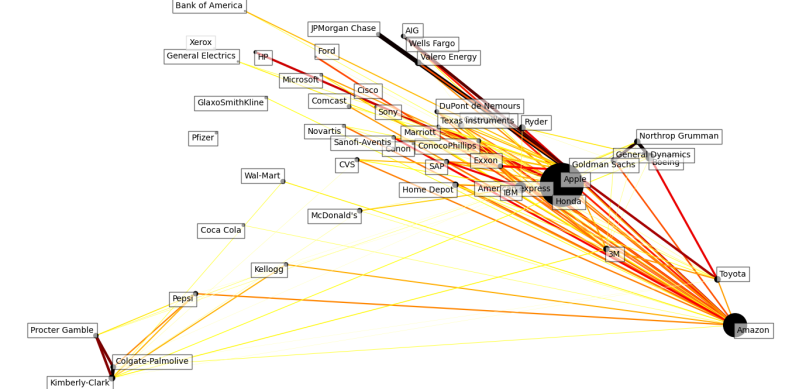
So maybe if that was true you might find a single business at the centre of a vast spider web. Finding such a correlation would be more important than any conspiracy theory be useful to know for how we predict buy and sell signals within trading. Therefore I map each year starting with 2010 and going through each year.
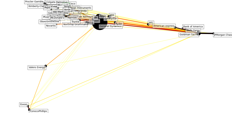
I have some bad news even a cursory glance shows that there does not appear to be a large spider in the centre of the web. The connections along with the graph change over time in both strength and sometimes cease to be connected, and where connections often repeat it is often for obvious reasons such as Goldman and Sachs and the Bank of America being well both banks.
Technology companies often seem linked, industrial heavy manufacturing often seemed linked, major Japanese technology companies often seem linked. i.e. when we see the clustering alongside the names it is often not hard without much technical knowledge to assume the impact is from the news that affects
So the below were some initial work. As you can see many stable connections repeat but some only exist in one graph. Therefore we can confirm that the stock market changes over time and even if we build a model then next year the system changes, therefore you can see from these yearly changes the risk of "system death" whereas a technical analyst creates a model that over time changes.
2011
As you can see several thick lines is connecting several positively correlated groupings. You could safely split these into a group that was banks, tech companies, and Japanese companies.

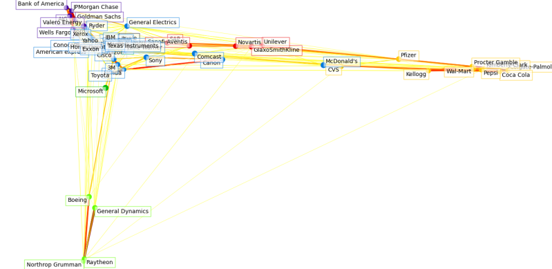
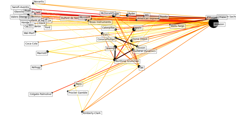
2012
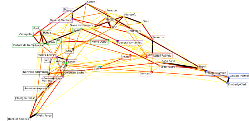
You can see this is decidedly different while the banks remain correlated there are fewer thick lines for some of the previous clusters.

2013
A lot of the correlations are hard to see we can see the banks are still close together.
2014
The bank cluster seems more diffused.

2015
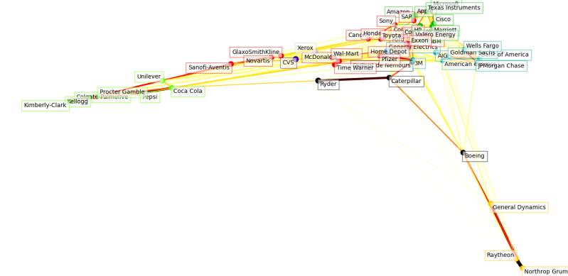
And then the banking cluster is back

2016
Honda and Toyota become heavily linked.

2017
What happened here they seem to have split in two?

2018 - there is not any data for Yahoo
Ryder and Caterpillar link up.
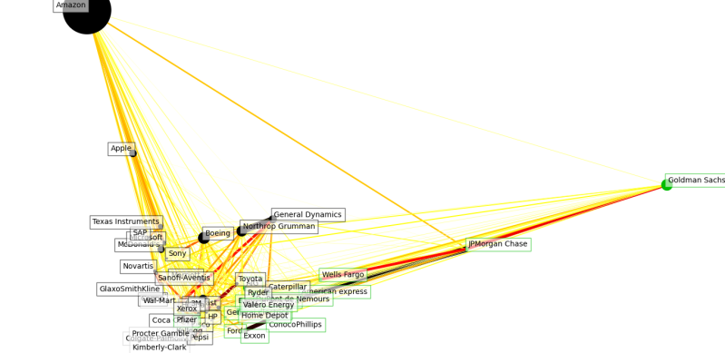
2019 - Tech Giants close together
2019
2022- One would not say there is a key single stock. Multiple values
Total Scale
The previous graph was showing data based on standard deviations. This is something that I didn't think should be done as while it will create some smoothing in the connection want I want is the capability to detect correlation only about increases. Standard deviation is important as it removes negatives and treats everything as a variation in values whether that variation is negative or positive.
Instead, we will be tracking total increases, negative variations will be a reduction of the size and therefore we will be looking in this graph at the correlation between times where price increases and correlation between.
This process is going to emphasise those companies that are growing, growing fast, and growing at the same time. This might be a sort of imperfect way of viewing the market as fast-growing is also the same thing as a bubble. Big also means over priced and is no indicator that it will continue to increase in price.
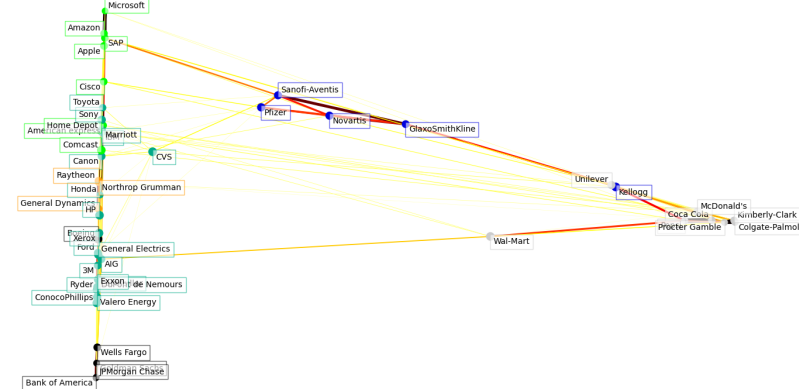
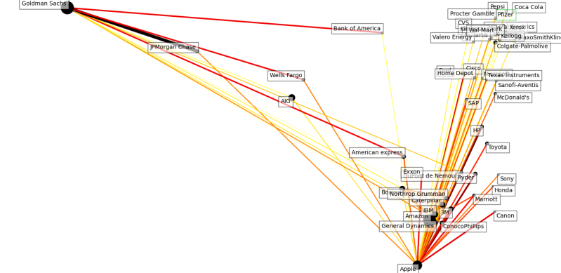
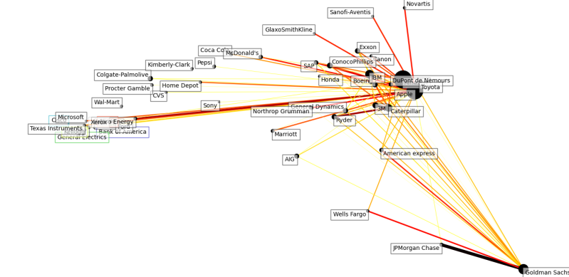
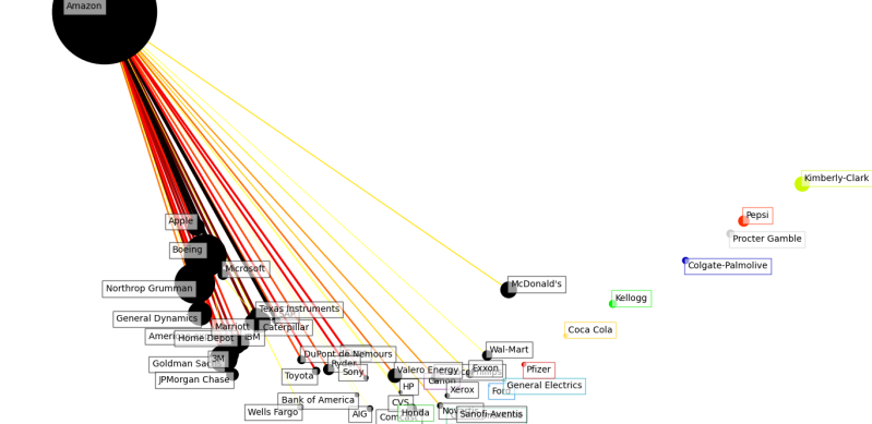
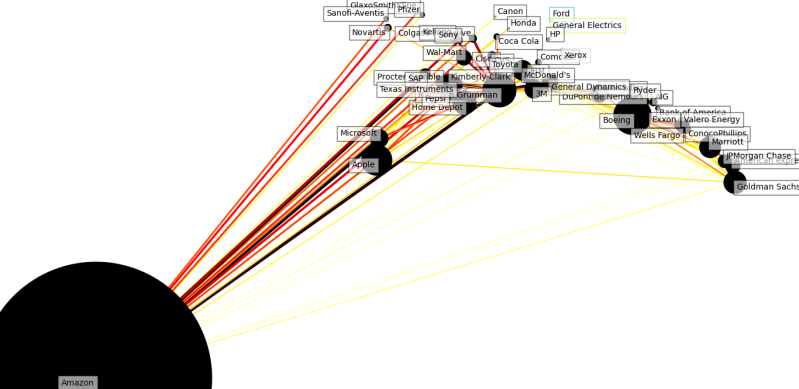
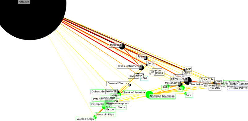
Though you can clearly see the rise of Amazon from 2011 as a small dot to a bigger dot each year. By the end there is a feeling that the market has become focused on a few Stella performers that oddly look like solar systems to the small orbiting companies. I found this a bit disturbing to think on as there does appear to be a story to tell in the data one I hope you will ponder with me. How big is too big?
Interestingly you might start to reconsider the question of whether there are any big winners in the stock market as you see the size Amazon gets to...
2010
2011
2012

2013
2014

2015
2016
2017
2018

2019
2020
2021 and there is not enough data to look at 2022.

Spread Overall Time
Amazon ends up looking very much like a black hole from the previous year, with a few orbiting stars. Does that mean a few big corporations are growing too fast?
Well, when we look at it again without the year filter. The below uses all the data over time. Amazon still looks like a black hole. The banks are very correlated with each other but you would expect that they would go up and down with each other on news from the federal reserve.
I wouldn't say though a few companies are taking all the profits. There is usually one huge tech company in the past it was maybe Apple today you might say it is Amazon. Clear thick lines are showing that certain businesses go up and down at the same time there is a benefit from this method for creating pair trading methods.
I am though unconvinced I feel this is a method more in line with day trading or may be useful if you were doing high-frequency trading. It might be good to know upon seeing a fall in price from one stock begin trading on that information before other actors have been able to do so. Though it doesn't necessarily mean that just because they fall together you can make predictions.
In the end, I think this won't be rolled into my AI work on stocks but I think it provides a great manner with which I could probably do manual investigation later and see if the stocks that the AI links together are the same as that naturally correlate with each other on the same day.
High-Level Overview of how this works
If several stocks routinely share a relationship then you would expect the prices to Co-Vary i.e. have covariance. A stock might have negative covariance i.e. it might go up routinely when another stock goes down. And we are primarily looking for if a stock goes up on the same day as it will be difficult to figure out really if such a thing was correlated if they happened days apart. Though I have been thinking about that subject even as I completed this.
So the first step is creating variation over the day which is going to be the difference between the opening prices and the closing prices at the end of the day.
CODE:
variation = close_prices - open_prices
We Transpose data so we have columns of variation and the rows are stocks themselves. We use Pandas standard deviation
We then transform the values being correlated into standard deviations. I followed this process as written at first but later I pulled out the conversion to standard deviation as I think it strips out scale information and while I can think of reasons why this was done I really preferred it without this step and also thought that there where mathematical counter-arguments that should remove this. I eventually remove this.
Next, the script uses manifold learning to reduce dimensionality. If this was not done then the process would fail to converge on a model. This is a fancy way of saying we have a variety of costs for each day meaning we have an object called stock that has 365 dimensions (1 for each day of the year). To my knowledge, there is no method of showing a graph with 365 dimensions on a piece of paper, and any clustering algorithm we use to find connections between these stocks will suffer from way too complicated calculations to compare these different stocks.
Scikrit Learn documents Manifold learning can be found here 2.2. Manifold learning — scikit-learn 1.0.2 documentation. I didn't find this especially useful. Though I eventually found this helpful blog post on Manifold learning What Is Manifold Learning? – PERPETUAL ENIGMA (prateekvjoshi.com).
Principle component analysis is what is used for dimension reduction where there is a linear relationship while Manifold learning is what is used when the relationship is nonlinear i.e. exponential etc.
Manifold learning attempts to take high multidimensional data sets and compresses them. Manifold learning does this by analysing the data across multiple dimensions and finding the points in the data which explain the most variance. Once this has been done irrelevant dimensions can be discarded and what will be kept will be summative pseudo dimensions that represent the originals.
A way to think about Manifold learning is we might have a series of data points we might be able to think of it as a piece of paper. We can fold this piece of paper, spin the paper around. As we make these changes what remains important is the relationships, distances, and spaces between these values.
The code for the manifold learning is below. When folding this data like the paper we get a higher dimensional representation of the data and then we can wrap it up into a multi-dimension version of itself. And if that sounds like a wormhole then it does seem like that; truth be told I am interested to learn more about Manifold Learning and this was the first time I came across it.
CODE:
node_position_model = manifold.LocallyLinearEmbedding(
n_components=2, eigen_solver="dense", n_neighbors=6
)
embedding = node_position_model.fit_transform(X.T).T
Thereafter it becomes a process of adding labels and joining the dots with lines the thickness and closer to black they are is based on how routinely they covary together.
After this it just connects up the black dots based on how big the correlations are it calculated when it created the initial regression and adds labels.
Conclusion
I think Manifold learning is something that I need to learn more about. I couldn't have learned how to make this work and write it in code myself which is a prerequisite for me being able to write this blog post as part of my oversimplified series. Though I think I will have to add it to the list of things to learn and as it sounds like it works the way a wormhole does but with data all the more reason why I am interested!
I can see the benefit of using this to decide on what stock to next to add my stock model. Though I think it might not add as much as I originally thought. By the end, I thought I would use this mapping method as a way of testing performance rather than deciding how to connect it upfront. There is nothing wrong with adding more stocks into the genetic algorithm and assuming they were related then turning it off. What I don't have is any methods to check why given connections might be important.
I like the graphs that this process produces a lot of things in the business world that are about finding correlations. Though an issue that comes up is that businesses have no way to visualize this process. I think it this advantageous for businesses to make graphs of shared covariance like this.
Though I am also a bit wary of this as a method. I am always mindful of Chart Junk. The analyst that mass produces pretty images and maximizes ink on the page has not done their company a service unless it is explainable to such laypeople. Saying that Amazon Stock covaries with Google stock might be obvious, it might not give any new information for decision making or might only be understood with the benefit of hindsight.
This is a method that I think has been used for Business/Data Analytics but one constrained by the need to explain it better. I have in the past personally struggled to explain a piece of regression analysis and resorted to graphs if I had this approach I think would have had a much better social impact if could explain it with such a graph.
Add comment
Comments
Wow! A lot of work has gone into this. Well done xx